Contact me
Enhancing the Digital Experience of Canada’s #1 Museum
Project Overview
The client
The Royal Ontario Museum
As the largest museum in Canada and one of the largest in America, the Royal Ontario Museum has quite a reputation for its diverse collections.
The ask
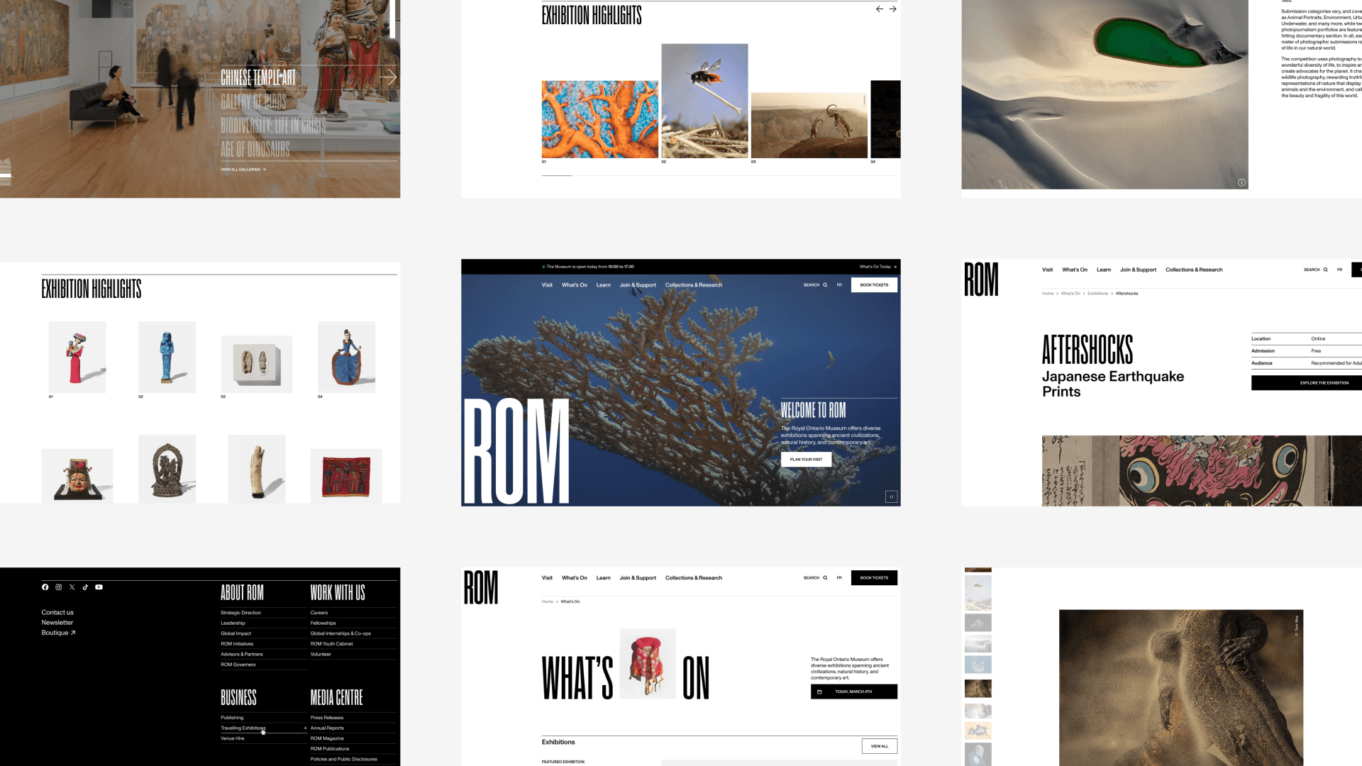
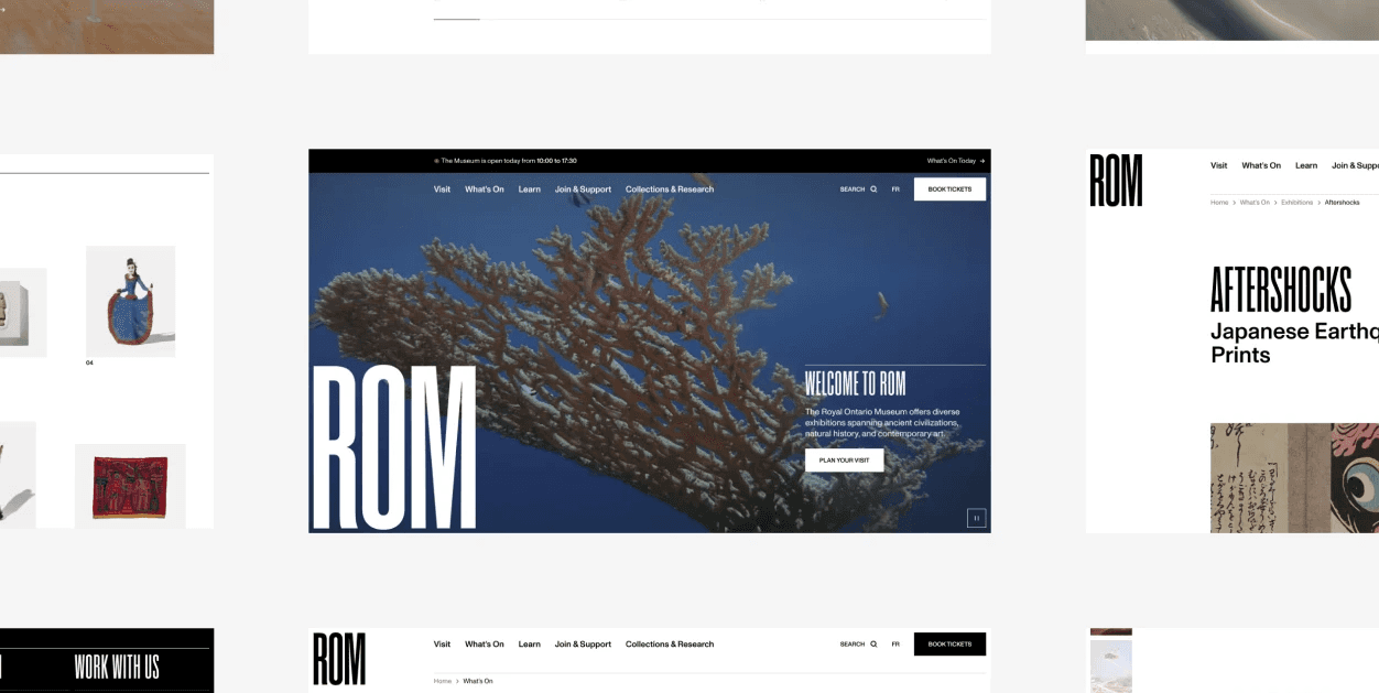
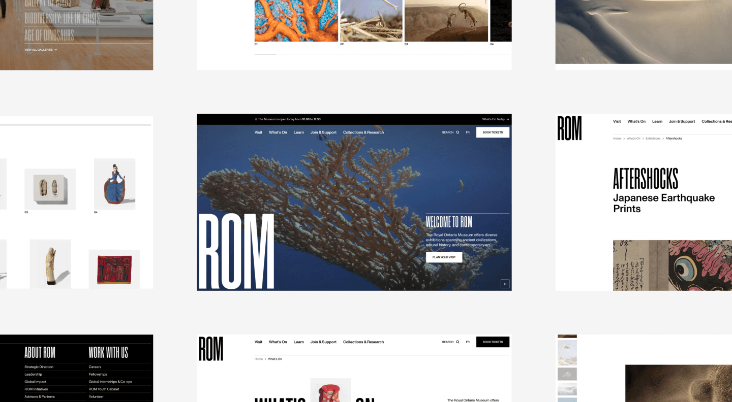
Complete website redesign
Following their rebranding, the Royal Ontario Museum wanted to redesign their website to improve on both aesthetics and user experience.
The role
UX Designer
Balancing business and user needs to streamline the navigation
Facilitating client workshops
Building user archetypes
Conducting user research
Designing lo-fi mockups
Collaborators
Strategy Expert
Creative Director
Product Owner
Technical Lead
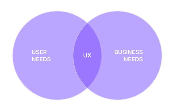
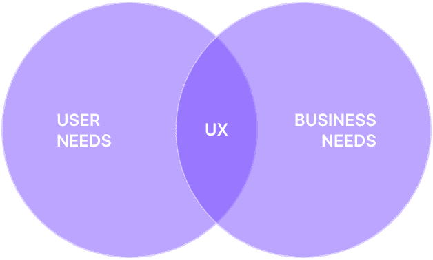
Identifying the business needs
The website plays a vital role in the ecosystem of the Royal Ontario Museum by providing essential information to visitors and contributing to its revenue stream.
1
Increase revenue from visitors, members, and patrons
2
Increase awareness and consideration of ROM’s content and programs
3
Increase loyalty through membership subscription and renewal
Creating Archetypes to Align the Team on User Needs
In order to better understand the user needs relative to the website, I used the existing media audiences to shape archetypes.
Why Archetypes Instead of Personas ?
Archetypes are more inclusive than personas as they avoid regrouping every user under a single face. They provide the same information as persona, but avoid implicit exclusion of minorities.
Data used
Frequency of visit
Importance of ROM’s cultural mission
Openness toward learning
Key drivers to choosing attraction to visit
Pains and gains for visiting ROM
Membership percentage
Main archetypes
Occasional Visitors
Tourists or local population that visit ROM less than a few times a year for entertainment value.
Challenges
Making the most of their visit while limiting their planification time
Needs
Curated selection of exhibitions, events and activities to engage with at the museum
General information and maps to help orient them onsite
Engaged Visitors
Visitors that have a profound interest in ROM and its offerings, beyond entertainment value.
Challenges
Staying interested and engaged with the museum’s offerings despite frequent visits
Needs
Discovering in-depth information on featured objects or collections on display at the museum
Being informed on limited-time exhibitions, events and activities taking place
secondary archetypes
Experts
Professionals or enthusiasts with a significant interest in specific topics related to ROM’s collections and research.
Learners
Learners are individuals engaged in self-directed education.
Educators
Teaching professionals that use ROM as a resource for teaching and engaging their students.
Defining Key Experience Areas
After gaining a thorough understanding of users and business needs, it became clear that content related to those themes would be of utmost importance.
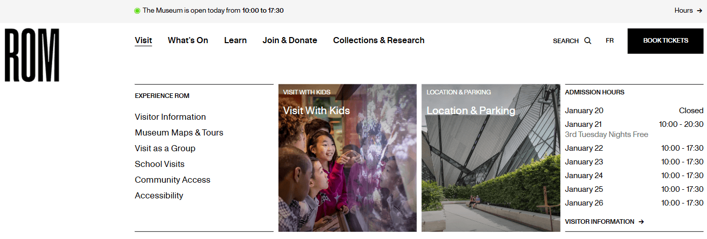
Visitor information
Demonstrating how the museum is a key destination while simplifying the users' planification time, showcasing important information on on-site amenities and key locations
Museum access
Simplifying the journey to find out about the entrance fee and ticket purchasing, as well as types of access to various activities and
Exhibitions and events
Facilitating planning and organization for visitors and members
Membership
Showcasing all the benefits of the various memberships tiers for users and how does this revenue stream benefits the museum to encourage adhesion
Programs and learning activities
Catering mostly to secondary audience, those type of content fulfill a vital part of the museum's role as a public institution focused on knowledge and history
And so, we embarked on a journey to review the content architecture and ultimately, streamline the website's navigation.
Starting from the Beginning…or Not ?
Initially, the client asked me to rework their whole content architecture as their current content had outgrown the original one.
However, I discovered that previous work had been done. Instead of disregarding it, I spent time evaluating the suggested new categories and labels. Everything seemed quite good and yet, the client was reluctant to move forward with it.
This made me wonder: what were the deeper issues at play here ?
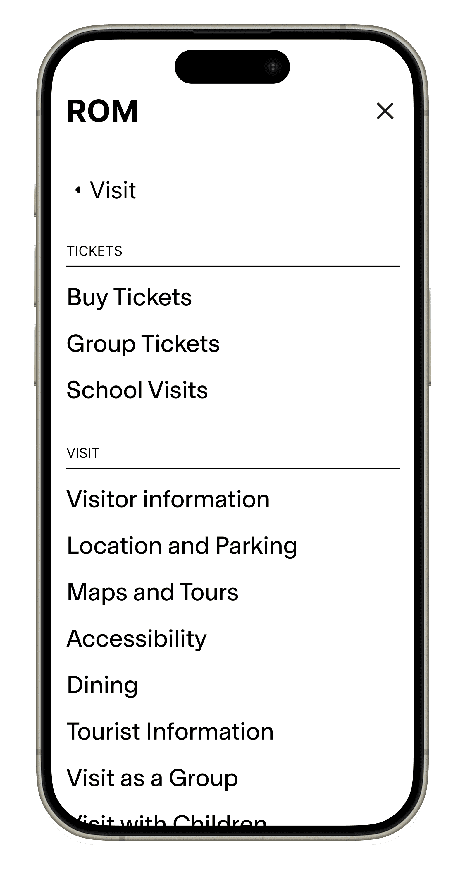
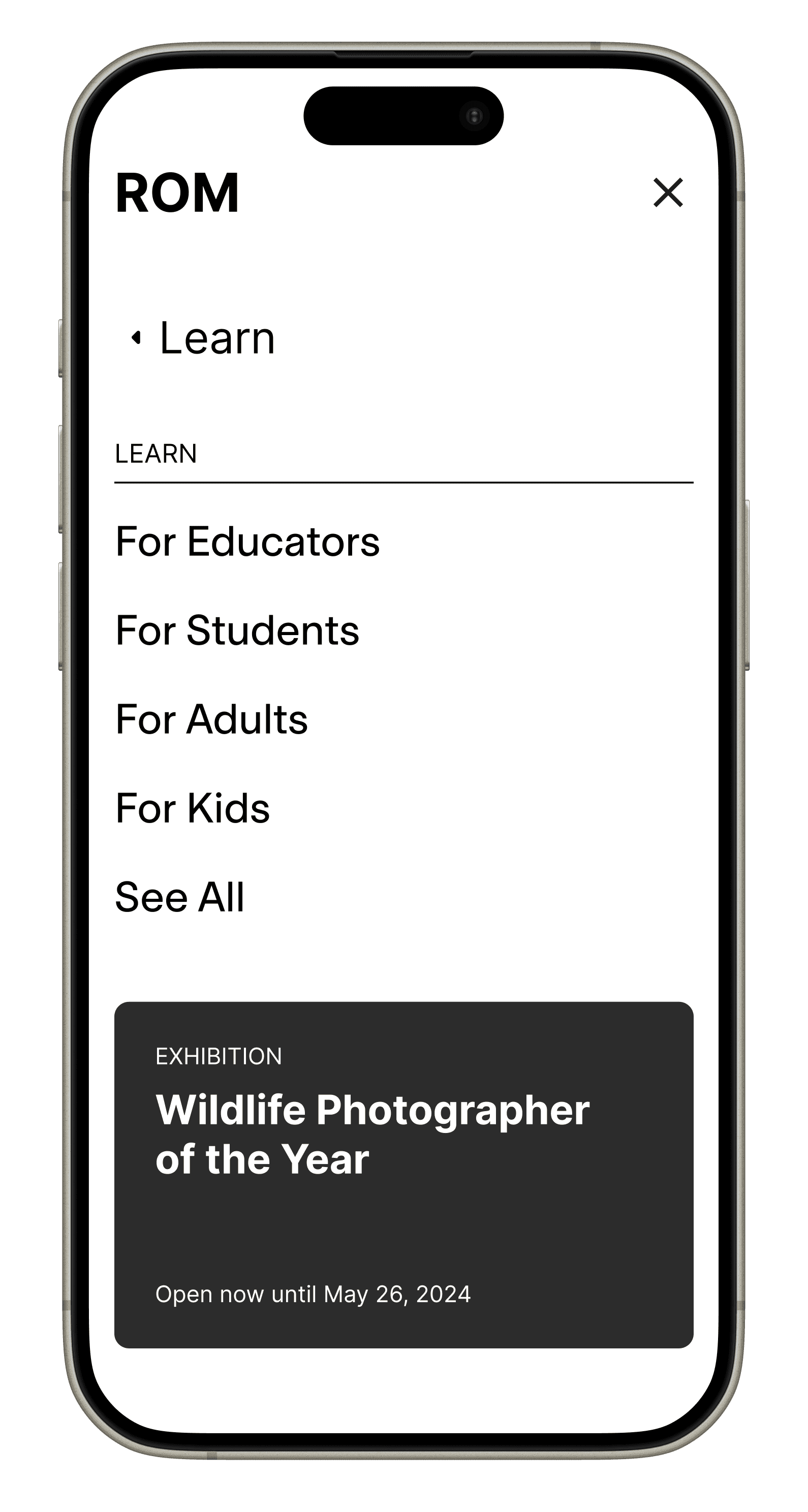
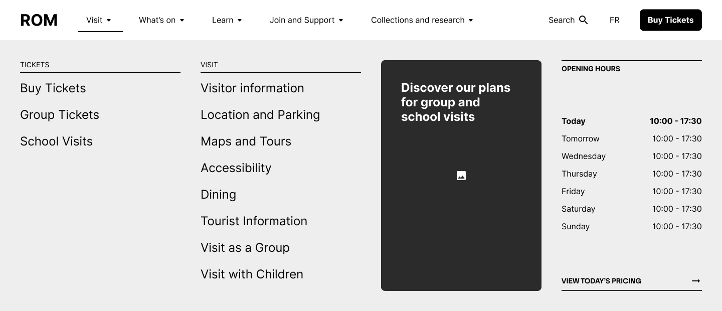
Visit
Activities
Events
Programs
Exhibitions
Tickets
Airing Out Doubts and Questions
To truly understand why there was so much resistance to the new sitemap, I facilitated a workshop with all major projects stakeholders. The goal was to figure out their concerns and bring everyone on the same page regarding the new sitemap.
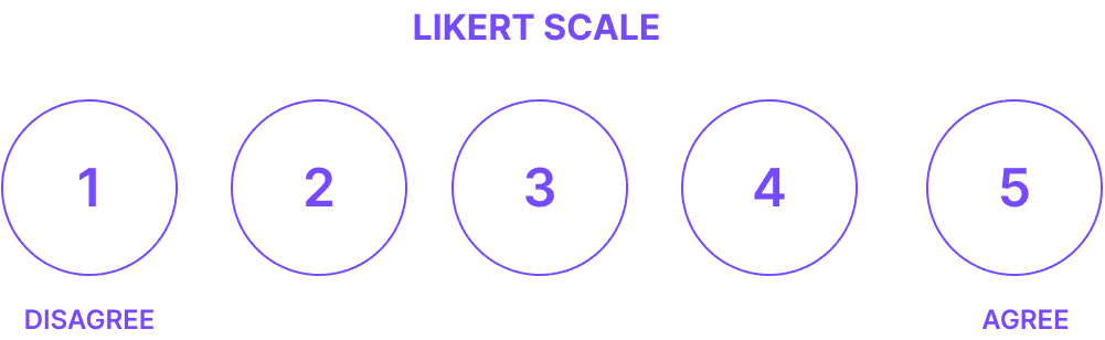
To help discussions, I put together a quick survey using the Likert scale to gather the stakeholders thoughts on :
Content coverage
User journey facilitation
Content categorization and hierarchy
Uncovering the Real Issues
The survey revealed that much of the stakeholders thought the sitemap did a pretty decent job of "bucketing the current content". During the workshop, the discussions focused on those two points :
Differentiation: to elevate the Royal Ontario Museum's website above the competition, a lot of comments focused on trying out new labels for the navigation
Lack of user research: most of them were adamant that the sitemap had not been tested by users and so they had no idea of knowing if it would perform well.
Understanding The Landscape
To address the first concern, I did a comprehensive landscape analysis of other museum sitemaps and label conventions. The goal was to understand how strong the conventions were. In doing so, I got a much better grasp on how much users rely on common concepts for their navigation.
Royal Ontario Museum
Gardiner Museum
British Royal Museum
Museum
Of Modern Art
The Met
Visit
Visit
Dine
Shop
Visit
Visit
Visit
Buy Tickets
N/A
N/A
Tickets
Buy tickets
Exhibitions and Galleries
What's On
What's On
Exhibitions and Events
Exhibitions and Events
Exhibitions and Events
Rom at Home
Learning
Collections and Research
Collections
Learn and Make
Collection
Learn
Art and Artists
Art
Learn with Us
Research
Join
Support
Donate
Member Login
Join and Support
Donate
Sign In
Membership
Support Us
Donate
Membership
Become a member
Make a donation
Capitalizing on Strong Conventions to Maximize Content Discovery
The truth was that museums were mostly re-using a mix of the same labels. This meant that users would have fairly strict expectations on content architecture. Choosing not to follow these conventions would probably cause more harm than benefits, as it would introduce an unnecessary learning curve into content discovery.
Redirecting Efforts Toward User Research
Fully aware that these arguments may not be enough to convince stakeholders, I proposed to redirect our efforts toward user research instead of spending time on a third iteration of the content architecture.
The clients and I opted to go for a tree test to gather as much early feedback as possible.
Key Takeaways
The tree test was highly successful and the content architecture was understood by most users. They were able accomplish most tasks, especially essential ones.
Average success rates
76%
Overall
80%
Direct
Multiplying purchase paths
Users purchase tickets through various paths, such as navigation, Exhibition Pages, and the What’s On section. This highlighted the need to accommodate diverse entry points in the design.
Keeping familiar labels for clarity
Using familiar labels from other well-known museums can help users quickly understand the website's content organization, reducing cognitive load and improving navigation
Implementing internal linking to bridge gaps in content with ambiguous categorization
Some tasks took users to multiple sections of the sitemap, but effective internal linking can guide users to the right information within a few clicks.
Aligning design decisions with audience expertise
The low success rate for “Completing a research project” reflects audience expertise; museum professionals and staff performed significantly better than regular visitors (75% vs. 23%).
Navigation To-Do List
Improve overall visual hierarchy and space use
Reducing the visual clutter of the secondary navigation component
Increase the visual weight of the main call-to-action
Decreasing the visual weight of each label
Decreasing the amount of labels
Facilitate the user's search for information
Introducing quick access to the most visited pages of the website
Removing deeper pages with low business and user impact from the dropdown menus
Creating visual hierarchy within each dropdown as well

Next Project
Helping a Startup Launch Their First Website
2024 — UX designer